Sunday, April 29, 2012

E-Portfolio


Introduction

Hi. My name is Kara Nicole Meadows. Welcome to my academic e-portfolio! I am currently an undergraduate student at Pennsylvania State University. I am double majoring in Crime, Law, and Justice and Psychology, and minoring in Spanish.This portfolio displays some of the work that I am most proud of having completed throughout my college career. As of right now, the majority of the assignments that it contains are from my LA101H class, so it mainly demonstrates how I have enhanced my writing and presentation skills. But, I do plan on showcasing work here from my other classes as well, so I will keep updating this portfolio over the next few years. For now, enjoy viewing some of my best work from college and how I have grown and  become a better student. Like my college experience, this e-portfolio is a work in progress.

Wednesday, April 18, 2012

Attention Please!


Celebrities 
& Advertising


It seems as though a celebrity appears in almost every ad these days, regardless of whether it is in a magazine, on a billboard, or on a commercial on television. We are not even the least bit surprised anymore when viewing said advertisements.
But why is it that nearly every company wants to showcase a celebrity or multiple celebrities in the advertising campaigns for   their products?
The obvious answer is that people are extremely interested in celebrities. In today’s society, celebrities have reached elevated statuses, to the point of where some are even considered godly. “Average” people, those who are not famous, practically worship celebrities, and many wishes with every fiber of their being to be just like them or even just to meet or come in contact with one of them. Scientific evidence has proved that this has neurological effects on consumers, which results in viewers of the ads going out and buying the products used by their favorite celebrities. This strategy literally messes with our minds and gets inside our heads. It causes us to think, “Well if name of celebrity says this product is good and works, then it must be true.”
In my opinion, the amount of attention celebrities receive has become a bit out of hand and a tad ridiculous. But at the same time, I fall victim to companies’ schemes because I cannot help but be intrigued by celebrities as well. Sometimes, it feels like I cannot resist watching and become incapable of looking away when they pop up on my television or computer screen. This is exactly what every company is trying to accomplish.
Therefore, the reason that featuring celebrities in advertising is such an effective technique is because overall the goal of all advertising is to capture the audience’s attention and attract the viewers’ gazes. Results of scientific studies show that the first aspect of advertisements that viewers respond to is the face of another human being. By making celebrities the human beings featured in their ads, the companies ensure that viewers will certainly recognize these faces more easily and with little effort. References:
[1] M. Cerf, E. Paxon Frady and C. Koch. Faces and text attract gaze independent of the tast: Experimental data and computer model. Journal of Vision (2009).
[2] C. Koch. The Quest for Consciousness: A Neurobiological Approach. Roberts & Company Publishers (2004).

Thursday, April 12, 2012

Don't eat yourself to death


RHETORICAL USE OF PATHOS IN ADVERTISING

Today, the creators of advertisements spend a lot of time thinking and evaluating the ideas they come up with for their ad campaigns. Advertisements are constantly becoming more and more creative, imaginative, and ingenious. This is extremely important because it keeps the audience and consumers interested, as opposed to boring them with the same old images and commercials. Their intentions change depending on the message they are trying to convey. Some ads are intended to make us laugh with their funny jokes, whereas others try to evoke other emotions such as love, hope, arousal, anger, disgust, fear, sorrow, or sadness.
Above is an advertisement from the “Obesity is suicide” ad campaign. This ad uses pathos to leave its viewers quite disturbed. The creators clearly designed this ad to be serious and did not intend to make their audience smile or laugh. The image displayed in this ad illustrates a strand of sausages tied around the neck of a man who is heavy and overweight. The analogy here is that overeating or eating too many unhealthy foods is equivalent to committing suicide by hanging yourself, in this specific example. Since the initial reaction of most people is to turn their heads away after first glancing at this ad, the scene depicted effectively stirs the emotions of its audience members. Once you have seen this ad, the image sticks in you head for long after having viewed it. This means that the ad campaign is successful in the way that it gets you to not only feel something, but also to remember what you saw and what you felt the moment you were looking at it. As a result, you are left with the feeling that there has to be something you can do to prevent this from continuing to happen and taking more lives. If action is taken, lives can be saved; therefore there must be something that we can and should do to help. Below is another ad from the same ad campaign. In my opinion, these two ads are equally creative and effective.


Friday, April 6, 2012

Forever & Always Coke


Rhetoric of Coca-Cola
Everyone knows the taste of a good, old refreshing Coca-Cola. Even people who do not really enjoy the taste of soda, like myself, have had it before. I do not often drink soda, but there are times when nothing tastes better than a Coke. A trip to the movie theater always qualifies as one of those times. I’m sure that I am not the only who thinks this way, and Coca-Cola knows this. They use this view, which can be considered a commonplace in American society, in their advertisements. The company’s ad campaigns frequently use tradition to get the attention of their target audience, which includes Americans of all ages. No one is too young or too old to sip a Coke. Okay, so this is not entirely true, but this is what the company wants us to believe. Emphasizing the importance of tradition, as Coca-Cola does in the two ads I have provided here, is how the company has reached the astounding levels of success that it is at today.
The first ad is one from back-in-the-day. It is simple, but uses very bright colors that allow the audience to enjoy viewing it. On the left side, tall buildings in a city are featured to symbolize an urban environment, and on the right side there are mountains signifying a rural environment. This establishes that Coke products are for everyone, no matter where they happen to live. It places the brand name in its usual font at the bottom of the ad to top it off.
The second ad is a new Coca-Cola ad. In the bottom right corner, the ad reads “125 years at the movies.” The purpose of this ad is to demonstrate just how long Coca-Cola has been around. In this way the company is establishing their ethos and logos. Their product must be pretty great if it has been served and has been one of America’s favorite beverages for at least 125 years. The three Coke bottles featured in this ad symbolize the progression of the film industry over the years. Starting on the left, the Coke bottle is in black and white, the one in the middle is a classic version in color, and on the right the bottle depicts the 3D technology that we can now view movies in today. I think this ad is really awesome and effective.


Friday, March 30, 2012

Fun in the Sun!


The Rhetoric of a Summer Ad

         As most people are at the moment, I am getting super excited for summer. It is most likely my favorite time of the year for so many reasons, and it is finally almost here. Personally, I grew up in Florida so I absolutely love the long, hot fun-in-the-sun filled summer days. I love spending day after day by the pool or at the beach in my swimsuit. Not to mention, my birthday is also during the summer. What could possibly be better?


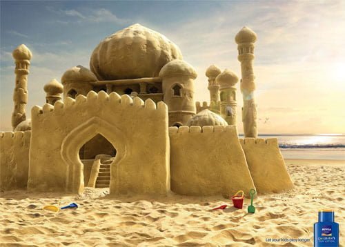
         This week I chose an advertisement that pertains to sunny, summer days. The ad I chose is for Nivea Skincare products, particularly their children’s sunblock in this case. There are not many words used in this ad, so a large image is used to function as effective visual rhetoric. The only words used in this ad campaign are the ones that make up the short sentence in the bottom, right corner. It reads, “Let your kids play longer.” This gets the message across that normally, playing in the sun needs to be limited by parents in order to protect their children from getting a bad, painful sunburn that can later turn into skincare. It is saying that with Nivea Sunscreen, that is no longer the case. When it is being used and applied to the children’s skin, they will be protected from the sun for more hours than they ever were before while using other skincare and sunscreen products. But this message is written in very tiny, plain font, so it is not the main focus of this advertisement.
         The main focus of this ad would have to be the grandeur image of a giant kingdom made out of sand on a beautiful beach day. It sets the scene for summer by playing off of nature’s natural beauty, as well as by showcasing a not so ordinary sand castle. The sand castle featured here is an example of hyperbole. It greatly exaggerates and overestimates a child’s ability to form a sand castle while spending a day at the beach. Instead of the average sand castle that we have all built or at least walked by at some point in our lives on the beach, it is an enormous palace. It looks extremely complicated to build and would definitely take an entire day to make, if not several days. In a way, this ad challenges it audience. It basically says we will provide you with the sunscreen and skincare products to be able to spend more time in the sun, now lets see what you can do with that capability. 

Thursday, March 22, 2012

dyson doesn't

Rhetoric of dyson

This dyson vacuum cleaner print advertisement puts typography to good use. The creativity of this particular ad is impressive. Anyone can add text to an advertisement, poster, or billboard in an effort to enhance his or her method of getting the point across. But, it takes thinking and a creative mind to effectively transform text into more than just words. This ad happens to be a perfect example of this.
Here, visual rhetoric and typography are used to sell a product; in this case the product is a dyson vacuum cleaner. The company chose to not only incorporate text into this specific ad campaign, but to make the text the focal point of their print design. Unlike the usual ads created by average companies that we see everyday, dyson did not just simply place words on their ad in order to talk about their product. The message simply says, “others clog… ours doesn’t.” They used an interesting font, which they typically use to write their slogan and the name of the company everywhere, and also filled in the unused space of some of the letters to convey their central message. This message being that while other vacuums clog constantly, dyson’s products never clog. This is the way in which they build their ethos and logos because it establishes their credibility as a company and shows that they are above the rest, and logically it makes sense to purchase a vacuum that you can actually use without out it continuously clogging up. As you can see, to demonstrate this, the spaces are filled in for the “others clog” part of the text. It does a great job of capturing the audience’s attention and making them look right at the words. Some people may even have to read the phrase more than once to catch on.

Friday, March 16, 2012

Rhetoric of Google


Google+

“Hey, what is _______________?”
“I don’t know. Google it.”

This is probably the most universally held conversation in our world today. Whenever we don’t know what something is or would like more information about something, the answer is always “Google.” Over the years, they have built up their ethos and climbed to the top by becoming the most popular and therefore credible search engine.


Recently though, Google has expanded its worth by becoming more than just your average search engine. They have added social networking abilities to the long list of things that they were already capable of doing. This is the way in which they chose to create pathos for their expansive audience. The social aspect of Google, known as Google+, and the advertisements that have been created to make it well known, are emotional appeals that convince people to become members of Google+ so that they can stay connected to everyone in their lives. The unique aspects of Google+ are the separate circles that individuals can create as a way of grouping their friends into categories making communication and sharing anything and everything much easier.
The ads for Google+ are very effective because they are entirely relatable to pretty much everyone. This is their way of making sure that their audience has no limitations and does not specifically target any certain division of people. Throughout the entire commercial a regular person is speaking about how they like to use Google+, instead of having a representative of the company raving about how genius their new invention is. This is how the ads appeal to the logos of the audience. After all, these days it’s logical to trust search engine most of the time. And besides, who doesn’t want a new and improved way to stay connected in life?